

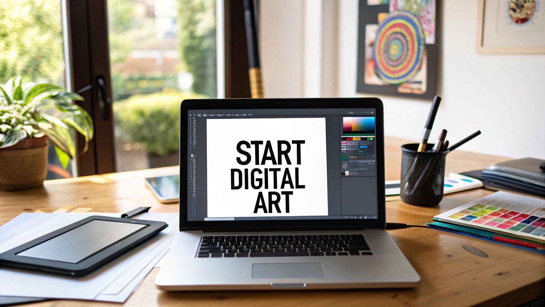
Mastering Digital Art: A Strategic Roadmap for Beginners
Venturing into the digital art landscape can feel like navigating a complex new frontier. With a dizzying array of hardware, software, and AI-powered tools, the initial barrier to entry may seem high. However, at its core, mastering digital art is a strategic process built on three pillars: selecting the right creative hardware, choosing software that amplifies your workflow, and a disciplined approach to learning foundational techniques. This guide is designed to be your operational roadmap. We will cut through the noise and present a clear, strategic path to take you from a blank canvas to a polished, professional-grade digital asset.
Your Journey Into Digital Art Begins Here – This isn’t merely about learning a new application; it’s about mastering a new medium with unparalleled flexibility and efficiency. Digital art unshackles you from the physical constraints of traditional media, offering a powerful, non-destructive workflow. We will systematically break down the entire process, empowering you with the confidence to execute from day one. We’ll analyze the essential hardware that becomes a high-fidelity extension of your creative intent, the software that serves as your digital production studio, and the core artistic principles that underpin all great work. Consider this your mission briefing for entering the digital creative space with a competitive edge.
The Growing Digital Canvas
The timing for entry into the digital art market has never been more opportune. The tools of creation—from affordable, high-precision tablets to sophisticated software suites—are more accessible than ever, fueling a significant wave of creative output. The market data validates this trend: the global digital artwork market is projected to expand from about $5.8 billion in 2025 to an impressive $17.72 billion by 2032, reflecting a compound annual growth rate (CAGR) of 17.3% over that periodcoherentmarketinsights.com. In practical terms, this means the high-cost barriers and physical overhead of traditional media are no longer gatekeepers. The market has been democratized. Any creator with a compelling vision can now access the tools to execute it without prohibitive capital investment. (See the detailed analysis in the digital artwork market report for more info.)
Importantly, do not attempt to master every tool immediately. The primary objective is to internalize the timeless principles of art—composition, color theory, and lighting—through a new, more forgiving medium. Remember, the “undo” function is not a crutch; it is your most powerful tool for rapid iteration and learning. Digital art allows you to experiment freely and learn from mistakes without fear of ruining your work, which can actually accelerate your growth as an artistclipstudio.net.
To begin, here is a quick overview of the core components required for your journey. We will delve into the technical specifications of each shortly, but this Digital Artist Starter Kit establishes the foundational elements of your digital toolkit:
Creative Hardware: A drawing device that suits your workflow – this could be a screenless pen tablet, a display tablet, or an all-in-one tablet computer – along with a capable computer (with sufficient RAM/CPU) to run art software.
Art Software: A digital art program that aligns with your needs and budget – from industry standards like Adobe Photoshop and Clip Studio Paint to beginner-friendly options like Procreate or the free/open-source Krita.
Foundational Techniques: A solid grasp of art fundamentals (composition, perspective, anatomy, color theory, lighting) applied in a digital context, plus mastery of digital-specific concepts like layers, brush settings, and color adjustments.
With these three components in place, you possess a complete, professional-grade setup. Now, let’s analyze each component in greater technical detail.
Choosing Your First Digital Canvas and Brush (Hardware)
Your hardware selection is the physical interface between your creative intent and the digital canvas. Choosing the right tool isn’t about buying the most expensive device; it’s about finding a system that minimizes friction and becomes a seamless extension of your hand. You have three primary hardware categories to choose from. There is no single “best” option—only the optimal choice for your specific workflow, budget, and creative objectives.
Screenless Graphics Tablets: The Classic Entry Point
Many professionals began their careers with a screenless graphics tablet, such as the industry-standard Wacom Intuos. The operational model is simple: you draw on a pressure-sensitive pad while observing the output on your primary monitor. There is a learning curve inherent to this setup, as you must develop the hand-eye coordination to draw in one place while looking at another. However, this motor skill adaptation typically occurs within a few days of consistent practicesolutions.xencelabs.com and soon becomes second nature. In fact, regular use (and even practicing basic tasks or games with the tablet) can help you get comfortable surprisingly fast.
The primary strategic advantage of a screenless tablet is the price point. These tablets are exceptionally affordable, representing a low-risk entry for testing the waters of digital art without significant capital outlay. For example, entry-level pen tablets can cost as little as $70–$100christophercant.com, a fraction of the cost of display-equipped devices. You still get precise pen pressure sensitivity and a natural drawing feel, especially with reputable brands (Wacom Intuos is designed to give a realistic pen-on-paper feel even at its budget pricecommunity.wacom.com). In short, a screenless tablet offers professional-grade drawing functionality at a beginner-friendly cost.
The trade-off is that you’ll need to overcome the disconnect between the tablet and the screen. This takes a bit of practice, but it has its own benefit: because you’re not drawing directly where your hand is, your hand never blocks your view of the artwork as it can on a screen tablet. Some artists even prefer this arrangement, as it allows them to see the entire image while drawing without a hand or stylus tip in the waychristophercant.com. Overall, if you’re budget-conscious or just dipping your toes in, a screenless tablet is an excellent starting point.
Display Tablets: Drawing Directly on the Screen
The next tier is the display tablet, exemplified by models like the Wacom Cintiq or the Huion Kamvas series. These devices are essentially high-fidelity monitors that you can draw on directly. The user experience is far more intuitive for most people, as the visual feedback is immediate and directly beneath the stylus tip, closely mimicking the feel of traditional drawing. This direct interaction eliminates the abstraction of a screenless tablet, allowing for a more immersive and focused creative process. Because there is no hand-to-screen disconnect, it’s generally much easier to pick up a display tablet and feel comfortable drawing right awaychristophercant.com.
For many professional illustrators and digital painters, this is the preferred studio configuration. You draw exactly where you are looking, which makes tasks like inking or fine line work more natural and precise. However, the trade-off is the significantly higher cost. Display tablets are more expensive due to the built-in screen technology. A Wacom Cintiq, for instance, can run into the several hundreds or thousands of dollars depending on size and features. This represents a more substantial financial commitment. If budget is not a major concern and you desire the most intuitive drawing experience, a display tablet can be worth the investment for the seamless hand-eye coordination it provides.
All-in-One Devices: Your Studio on the Go
The third—and increasingly dominant—category is the all-in-one device, most notably exemplified by the Apple iPad paired with an Apple Pencil (or similar pen-enabled tablets). This configuration offers a completely self-contained, portable digital studio. The drawing experience on a modern iPad is remarkably fluid and responsive. As one artist noted, the Apple Pencil feels like “an extension of my hand”kennethgreenprints.com. Latency is virtually non-existent (on an iPad Pro, the Apple Pencil’s drawing latency is as low as ~9 milliseconds, which is below the threshold of human perceptionzugucase.com, meaning strokes appear instantaneously). Workflow optimizations like the Pencil’s double-tap tool switch (to toggle eraser or other tools) create a seamless and efficient process.
With an iPad, you have the benefit of portability and ease of use. You can sketch from the couch or take your digital studio outdoors or on trips. While the initial investment may seem high (the cost of an iPad plus the Pencil), remember that you are acquiring both a powerful computing device and a professional-grade drawing instrument in one. In other words, it’s not just a peripheral; it’s an entire computer that can run sophisticated art apps (and do a lot more). Many artists find the iPad with Procreate or similar apps to be a game-changer for sketching and painting on the go, without being tethered to a desktop.
The right tool doesn’t make you a better artist, but the wrong tool can create friction that impedes your process.Select hardware that removes technical barriers, freeing you to concentrate on your creative execution. So, which is the correct strategic decision for you? It depends on the answers to a few key questions:
What is your budget? Screenless tablets offer the lowest barrier to entry, while display tablets and iPad devices require a more significant investment. If funds are tight or you want to start small, a pen tablet is the prudent choice. If you have a larger budget and prioritize intuitive feedback, a display tablet or iPad might be justified.
What is your intended creation environment? For mobile and flexible workflows, the iPad is the undisputed leader since it’s completely portable. The other two options typically require a computer; they are better for a dedicated desk or studio space. Consider whether you need to draw on the go or only at a set workspace.
What is your ideal workflow? Do you prefer a dedicated, stationary studio setup (which a display tablet excels at) or a versatile, multi-purpose device (like an iPad) that can serve for both art and general use? Also, if you do a lot of line art or precise drafting, a display may benefit you, whereas for broad painting strokes and portability, a tablet without display could suffice. Personal preference plays a big role.
A final technical consideration: regardless of your tablet choice, pay close attention to your computer’s performance. Digital art software is resource-intensive. Large canvas sizes, high-resolution layers, and complex custom brushes can tax your system. At least 16 GB of RAM is recommended for a fluid workflow, and a powerful multi-core processor will help prevent frustrating lag, especially when working with many layers or applying filtersdell.com. In short, ensure your hardware (PC or iPad) has the horsepower to keep up with your creativity. An inadequately powered computer can bottleneck even the best tablet, so don’t overlook specs like RAM, CPU, and if applicable, GPU for 3D or heavy Photoshop painting.
Finding the Right Digital Art Software
With your hardware selected, it’s time to choose your digital canvas software. Your software is your studio, your toolset, and your production environment. Identifying a program that aligns with your creative process is a critical strategic decision. The market is saturated with options, which can be intimidating. However, do not get paralyzed by the search for the single “best” application. The optimal program for a seasoned concept artist might be needlessly complex (and expensive) for a beginner, while a simple, inexpensive app might lack features you’ll need as you advance. Let’s analyze the industry leaders and some high-value alternatives to find the right fit for your objectives.
The Industry Titans
Certain programs are considered industry standards for a reason. They are feature-rich, versatile, and have been rigorously tested in professional production pipelines for years. Two standouts are:
Adobe Photoshop: Originally a photo editor, Photoshop has evolved into the de facto standard for digital content creation. Its capabilities span digital painting, photo manipulation, and graphic design. Photoshop’s brush engine is incredibly sophisticated, and proficiency in Photoshop is a near-universal requirement for many professional creative roles. The downside is its subscription-based model (Adobe Creative Cloud), which can be a barrier for new entrants on a tight budget.
Clip Studio Paint (CSP): Ask any professional comic or manga artist and you will likely hear praise for Clip Studio Paint. It is renowned for its exceptionally smooth brush engine and specialized toolsets that streamline inking, panel layout, and line art. Many artists (myself included) find the drawing feel in CSP to be more natural and responsive than in Photoshop, especially for line work. Furthermore, its one-time purchase model (for the desktop version; the iPad version uses a subscription) presents a significant long-term value proposition. CSP is heavily used in illustration and comics and has features like frame-by-frame animation support as well.
These applications have a substantial learning curve and come at a cost, but mastering one of them is a worthwhile investment if you are serious about a career in digital art. They are the “Photoshop and Painter” of today’s digital art world – robust and time-tested.
Budget-Friendly and Free Options
The notion that high-quality art requires expensive software is a myth. Some of the most potent tools available are also the most accessible. I cannot overstate this: expensive software does not create better artists. The best tool is the one that allows your ideas to manifest with the least friction. Here are two top recommendations for high-value, beginner-friendly software:
Procreate (iPad): If you’re using an iPad, Procreate is practically a non-negotiable acquisition. Its user interface is widely praised for being elegant and minimalist, yet it conceals a deep, professional-grade feature set. Procreate feels incredibly intuitive and was designed specifically for multi-touch and Pencil input on iPad. For a modest one-time purchase (around $12.99, no subscription) you get a powerhouse of a program. Even professional artists love Procreate for its agility and ease of use – it really is “powerful and easy-to-use,” suitable for both creative professionals and aspiring artists, with pay once, no subscriptionprocreate.com.
Krita (Desktop): This is unequivocally the most powerful free digital painting application available. Krita is an open-source project, and it delivers a feature set that truly competes with premium software. It has an excellent brush engine, robust layer management (including layer groups, masks, etc.), and even animation capabilities. Krita is available on Windows, macOS, and Linux. It’s made by artists, for artists and has gained immense popularity in the art communityallthingsopen.org. Despite being free, it doesn’t skimp on features – it’s easy to use with a user-friendly interface and extensive customization optionsallthingsopen.org, making it ideal for beginners. Yet it’s powerful enough that even experienced artists (and some studios) use it for professional work. In short, Krita proves that free doesn’t mean inferior when it comes to art software.
Starting with one of these tools allows you to master the fundamentals without the financial pressure of a recurring subscription. You can always migrate to a different platform later as your needs evolve. The key is to begin creating immediately rather than getting bogged down learning a super-complex interface. Procreate and Krita both let you jump in and draw with minimal fuss, which is exactly what a beginner needs.
The New Frontier: AI-Powered Creative Partners
The creative landscape is undergoing a paradigm shift, driven by artificial intelligence. Far from being a gimmick, AI-based tools are rapidly becoming practical partners in the creative process. In fact, the global AI-in-art market is forecast to reach approximately $5.3 billion in 2025, a clear indicator of this technology’s rapid adoption and market impactartsmart.ai. These tools are dismantling old barriers and providing a powerful accelerant for new artists.
However, it would be a strategic error to view AI as a mere “push-button art generator” that replaces the artist. For the professional, AI is a powerful co-pilot. Think of it as a smart assistant that can shatter creative blocks, rapidly iterate on compositions, or generate unique elements (like textures or reference poses) for use in your paintings. The goal is to augment, not replace, your creativity.
Platforms like Legaci Studios (Legaci.io) are at the vanguard of this movement, integrating AI in ways that enhance the creative process rather than overshadow it. Legaci’s platform, for example, is engineered to offer a comprehensive generative media solution that gives creators control and scalability, moving beyond simple image generation into a full-fledged production toollegacistudios.com. (Legaci Studios is a platform built by artists for creators, designed to dismantle high costs and restrictive “walled garden” limitations in many current AI toolslegacistudios.com.) In practice, this means features like generative image prompts, AI-assisted brainstorming, and rapid prototyping are directly built into an artist’s workflow. A screenshot of the Legaci.io interface, for instance, shows how generative tools sit side-by-side with your standard tools, ready to assist when you need them. The strategy is to fuse your unique vision with the computational speed of AI – enabling you to allocate more time to high-level creative decisions and less to tedious grunt work.
Emerging platforms like Leonardo AI similarly are making waves. Leonardo.ai is an AI image generation tool that allows you to produce stunning visuals with unprecedented speedoutrightcrm.com and stylistic consistency. Such platforms often include features like outpainting, inpainting, upscaling, and style transfer that can significantly cut down the time spent on repetitive tasks. It’s important to note: using AI does not mean pressing a button and accepting whatever comes out. Professional artists use these tools iteratively – generating variations, cherry-picking and combining results, and painting over or refining the outputs to suit their vision. In essence, AI becomes another tool in your toolbox (like a really smart brush) that can suggest ideas and options you might not have conceived alone.
(For a deeper exploration, check out our guide on AI image generation tools which provides a strategic analysis of various platforms and how they can slot into a creator’s workflow.)
Learning the Fundamental Digital Techniques
You now have the hardware and software. Now it’s time to execute on the technique. This is where we move beyond equipment and into the core competencies that will define the quality of your work. No matter which device or app you use, the following fundamentals are crucial to producing polished digital art.
Embrace the Magic of Layers
If there is one concept to internalize in digital art, it is layers. Think of layers as a stack of transparent acetate sheets that together form the final image. You can draw or paint on one layer without affecting the layers underneath. For example, you might sketch line art on one layer, apply base colors on a layer beneath it, and add shading and highlights on layers above, all independently. This layered approach is the cornerstone of a non-destructive workflow: you can experiment freely, because mistakes are isolated to individual layers and can be adjusted or removed without wrecking the rest of your work.
Develop a disciplined habit of naming your layers and organizing them into logical groups. It might seem tedious, but it will save you headaches later. When a client (or your own critical eye) requests a color change on a single element in a complex composition, you’ll be thankful if that element is isolated on its own layer called “Character_Skin” instead of lost among 50 layers named “Layer 23 copy”. Organized layers = efficient editing.
Above all, use layers to your advantage: block out your composition with big shapes on one layer, refine details on others, keep your line art separate from colors, etc. If a shadow doesn’t work, you can simply delete or hide that shadow layer and try again, with your base colors untouched beneath. The ability to iterate quickly and safely is what makes digital art so powerful compared to traditional media.
Get a Feel for Your Digital Brushes
Next, let’s address brushes. Your software likely includes a vast library of brushes, but mastery comes not from having hundreds of brushes, but from deeply understanding the parameters of a select few. At minimum, you should become comfortable with the basic round brush and a soft airbrush, adjusting their settings as needed. To create expressive, dynamic lines and forms, you must learn to control three key settings of your brush:
Pressure Sensitivity: This links your physical pen pressure to the digital output. Press lightly for a thin or faint line; press harder for a thick or opaque line. This is what infuses your line work and strokes with life and character, much like varying pressure with a real pencil. Modern tablets offer thousands of pressure levels to capture subtle differences. Example: Inking with varying pressure can give you tapered lines that start or end delicately. Pressure sensitivity allows natural variation in stroke thickness and opacityxp-pen.com – a gentle press yields a fine, light mark, whereas a firm press yields a bold, thick mark.
Opacity: This setting controls the transparency of your brushstroke. At 100% opacity, the stroke is fully opaque; at 50%, it’s semi-transparent. Lowering opacity is essential for building up color gradually and creating smooth tonal transitions, similar to glazing in traditional painting. Many digital painters keep a brush’s opacity pressure-sensitive as well, so pressing lightly lays down a semi-transparent stroke and pressing hard gives a solid stroke. This is great for softly layering colors. (Remember, opacity is about the “paint” itself being see-through or not. If your brush is set to 50% opacity, multiple passes will eventually build up to full coverage only if you lift and paint over again, since one stroke won’t exceed that levelf64academy.com.)
Flow: Often confused with opacity, flow controls the rate at which paint is applied. Think of it like an airbrush’s nozzle: a low flow means the paint comes out slowly, allowing you to gradually build up to full opacity without lifting the pen, whereas a high flow lays down color quickly. Flow is like how fast the “ink” flows from the brush – for example, 10% flow will require you to scribble over an area a bit to reach full opacity, whereas 100% flow lays full opacity immediately. A low flow combined with pen pressure gives very smooth blending, akin to feathering a marker or using a very light touch with real paintf64academy.comf64academy.com. In practice, using lower flow settings lets you create subtle gradients and smooth shading by building up pigment gradually (much like a traditional airbrush effect).
Mastering these three parameters (often in combination) is what enables you to achieve a wide range of effects with just one or two brushes. Dynamic brush control is what digital art is all about – for instance, in programs like Photoshop or Procreate, pen pressure can control not just size but also opacity or flow simultaneouslyxp-pen.com. By varying your hand pressure and stroke speed, you can mimic the feel of pencils, inks, or paint. This is how you develop a unique and recognizable style.
Take time to practice making strokes with different pressure, opacity, and flow to see how they interact. Once you’re comfortable, you can then explore texture brushes and specialty brushes (like ones that mimic foliage, clouds, etc.), but always with an understanding of what fundamental settings make them tick. Ultimately, a brush is just a tool – it’s how you wield it via settings and technique that matters.
(Refer to the visual guide in our resources that illustrates a typical professional workflow: you’ll notice how artists start with low opacity/blocking in, then gradually refine with higher opacity and smaller brushes. Each technique builds upon the last, resulting in a robust and efficient methodology.)
Speak the Language of Digital Color
Finally, let’s address color in the digital realm. Working with color digitally offers unparalleled flexibility, but it also means you have an infinite gamut at your disposal – which can be overwhelming. Here’s how to approach it strategically:
First, understand the color picker. Most software will let you choose colors by their Hue, Saturation, and Brightness (HSB) values. Rather than randomly clicking on the color wheel, it’s best to build a deliberate palette. Start by picking a few base colors that set the mood (for instance, a dominant color for your scene, plus perhaps a secondary color and an accent). From those, use HSB adjustments to create harmonious variations: a lighter tint for highlights (raise the brightness), a darker shade for shadows (lower brightness), or a desaturated version for less important background elements (lower saturation). By deriving colors from a limited selection, you ensure your artwork feels cohesive and intentional rather than a patchwork of arbitrary colors.
One of the most potent digital tools for color is the use of Adjustment Layers (or similar adjustment operations). These are special layers that non-destructively modify the appearance of layers beneath them. They can be toggled on/off or edited at any time. Key types include:
Hue/Saturation adjustments: Instantly shift the overall color scheme of your image or a layer group. For example, you can turn a blue sky to a green twilight or make a red character’s outfit blue, all with a slider. This is incredibly useful if you decide to change the mood of a scene from, say, summer to autumn – just tweak the hues toward golds and oranges.
Brightness/Contrast or Levels/Curves: These allow you to globally (or locally) control the tonal values. Pushing contrast can make an image “pop” more, whereas lowering contrast can give a more subdued, atmospheric quality. Often after finishing a piece, artists will use a slight contrast boost to enhance the punchiness of the final image.
Color Balance: This lets you finely tune the color bias in shadows, midtones, and highlights. For example, you might push the shadows of an image toward blue and the highlights toward a warm yellow to achieve a cinematic color grading. Little tweaks like adding cool tones to shadows can unify the piece and add depth.
The key point is that your ability to control color will greatly impact the emotional resonance of your art. A skilled use of color directs the viewer’s eye and reinforces the story you want to tell. Always consider the values (light vs dark) of your image first – a strong value composition will read well even in grayscale. Then use color to enhance, not carry, the composition (unless color is the point, like in an abstract). Practice with adjustment layers to see how much you can alter an image after the fact – it’s quite empowering and will teach you to think in terms of color relationships rather than absolute colors.
Finally, while this guide is focused on raster painting (pixel-based art) as an excellent starting point, remember to expand your skillset over time. For instance, learning how to create a vector graphic from scratch (using tools like Adobe Illustrator or Inkscape) will give you complementary skills for clean, scalable art, which is useful for graphic design, logos, and certain styles of illustration. The more techniques you master, the more versatile you become. Every new skill (raster, vector, 3D modeling, etc.) is another tool in your professional arsenal and can open up new opportunities for creative expression and income.
Mastering these fundamentals—layers, brushes, and color—is the most critical phase of your development. With a solid foundation, you can tackle increasingly complex projects with confidence.
Building a Workflow That Works for You
A repeatable, efficient workflow is what often distinguishes a professional from an amateur. It’s the structured process that consistently transforms an abstract idea into a finished, polished asset. Note that this isn’t about stifling creativity with rigid rules; it’s about developing a reliable system that supports your creative flow rather than hindering it.
Let’s construct a workflow that becomes an instinctual, repeatable process for you. Think of it as a series of stages: Ideation → Structuring → Rendering → Post-processing. By breaking your work into stages, you can focus on one aspect at a time and make intelligent, strategic decisions at each step, rather than feeling overwhelmed by everything at once.
The Idea and Sketching Phase
Every great piece begins as a conceptual spark. This is the ideation phase. Start by gathering inspiration and reference material for the mood or subject you want. Many artists create a mood board – a collection of images that inspire the style, mood, lighting, or color palette for the piece. A tool like PureRef can be invaluable for this, providing a simple canvas to aggregate reference images. The goal is not to copy, but to distill elements that resonate with your vision (e.g., the dramatic lighting from one image, the color scheme from another, etc.).
Once you have a direction in mind, move to thumbnail sketches. Thumbnails are small, rough sketches that focus entirely on composition and value structure, not details. Do 5–10 quick variations exploring different layouts: try different camera angles, framing, and arrangements of the major shapes in your scene. At this stage, each sketch might take only a few minutes. You might ask yourself: Would a low camera angle make this character look more heroic? What if I place a large shape on the left vs. the right – how does it balance? The point is rapid exploration. Because they’re so small and quick, you won’t be tempted to add detail – you’re forced to consider only the big picture.
After generating several thumbnails, pick the one that best captures the feeling you want. This will be your blueprint moving forward.
Structuring Your Artwork for Success
With a winning thumbnail chosen, it’s time to impose structure. This is where disciplined habits prevent future complications. Start by creating a clean, confident line art or outline on a dedicated layer (if your style involves linework). This line drawing is effectively the blueprint for your piece, defining the forms and their placement. It doesn’t have to be super polished unless you plan to keep the lines in the final – but it should clarify all the major elements.
Next comes blocking in base colors, a process often called “flatting”. Create new layers underneath your line art (if you have lines) for each major element’s flat color. For example, one layer for the character’s skin base color, one for hair, one for clothing, one for background elements, etc. Use solid, flat colors (no shading yet) just to separate the areas. Many artists use lasso selections or a paint bucket for this step. It can be tedious, but isolating each element on its own layer (or at least its own contiguous area) pays huge dividends later when rendering. If you need to change the color of the character’s shirt, you can just lock that layer and repaint it without affecting anything else.
Name your layers descriptively (e.g., “Sky_Flat”, “Character_Jacket_Flat”). It may seem obsessive, but future-you will thank past-you, especially in complex projects. There’s a reason professional files aren’t named “final_v3_finalFINAL.psd” with 100 unnamed layers – organization is key in a production environment.
At this stage, you might also set up some helper layers or guides: for instance, a background grid for perspective or a value check layer (some artists put a temporary black-filled layer on top set to Color blend mode, which turns the image black-and-white, so they can toggle it to check values).
The main goal of the structuring phase is to have a clear roadmap of your piece: clean drawing (or shapes) and flat colors correctly placed. It’s like setting the stage before the actual performance (rendering) begins.
Rendering and Bringing It to Life
Now comes the rendering phase – turning those flat shapes into three-dimensional forms through light and shadow. This is typically the most time-consuming but also the most rewarding part, as your artwork starts to come alive. A systematic approach will help you not get lost in the weeds too early:
Establish Core Shadows: Choose a direction for your primary light source if you haven’t already. On a new layer above a base color (say the skin), set that layer’s blending mode to Multiply (which makes colors darker). Clip it to the base layer (so your shading doesn’t spill outside the skin area). Using a soft or semi-soft brush and a cool, slightly desaturated color (shadows are often cooler in hue), paint the areas that would be in shadow—basically where light doesn’t reach. This immediately gives form to the flat shapes. Because the layer is in Multiply mode, the shadows will interact with the base colors naturally (e.g., multiplying over a pink skin base yields a richer shadow). You might lower the opacity of this layer if the shadows look too dark.
Introduce Highlights: Similarly, create a new layer for highlights. Often setting this one to Screen or Overlay mode works well (Screen makes things lighter; Overlay increases contrast). Use a warm, light color (if your light source is warm) and paint where the light hits surfaces directly – the tops of forms, edges facing the light, etc. This starts to give the illusion of volume. The contrast between your Multiply shadows and Screen highlights defines the basic lighting of the scene.
Refine and Build Up: At this point, you have the basic lighting laid in. Now refine the rendering by blending the shadows and lights into the base color more smoothly, if needed. You can do this on normal layers with lower opacity brushes, or use tools like the smudge/blending brush. Add midtones where appropriate. Also consider bounce light (light reflecting from environment) – e.g., subtle blue rim light on the shadow side from the sky. You can add more layers for these if it’s easier to manage.
Textures and Details: Once the big light/shadow relationships are established, you can start adding texture and fine detail. Use custom brushes or photo textures on Overlay/Multiply layers to texture clothing, skin, ground, etc. For example, you might apply a subtle canvas or paper texture over the whole image to give it a unified feel. Or use a speckled brush on a low opacity to imply skin pores or the grain of wood. Small highlights (the glint in an eye, the specular shine on a wet surface) go last – they are like the “sparkle” that adds realism. Be careful not to zoom in too early or you might spend hours detailing something that isn’t even noticeable in the final image.
This phased approach – shadows, then highlights, then finer details – prevents you from getting bogged down too soon. You’re essentially sculpting the form of your painting: first rough, then progressively finer. Working from general to specific ensures that the overall image works at a basic level (in terms of light and composition) before you put effort into the minutiae.
The Final Polish
I operate on the principle that the final 5% of effort delivers 95% of the perceived quality. Once rendering is complete and all elements are in place, the piece enters post-production. These are the global adjustments and subtle tweaks that unify the image and give it a professional finish:
Overall Color Grading: You may apply an adjustment layer or two on top of everything for a final color grade. For instance, you might push the shadows slightly blue and the highlights a bit warmer via a Color Balance or Curves adjustment. This can dramatically enhance the mood and cohesion of the piece (common in concept art and illustration to give that cinematic feel).
Levels/Contrast: Check your darkest darks and lightest lights. Often a slight levels tweak (deepening the darkest 5% of tones, for example) can increase the image’s impact. Be careful not to blow out true whites or lose detail in blacks unless deliberately for style.
Sharpening: Digital paintings can sometimes look a tad soft. A light sharpen filter on a flattened copy of the image (or using the Unsharp Mask filter with low radius) can crispen up details, especially if the piece will be viewed on screens. For online presentation, a little sharpening helps counteract the resizing blur that can happen on social media platforms.
Cleanup: Zoom in and do a sweep for any mistakes – stray marks, edges that should be cleaner, etc. This is the time for nitpicking fixes. Also ensure your values read correctly in grayscale (toggle a black & white adjustment to see) – if not, subtly adjust.
These finishing touches are what elevate a good piece of art to a great one. It’s that extra polish that commands attention and makes a viewer stop scrolling when they see your work. Think of it like mastering – what audio engineers do for music after mixing – it harmonizes and refines everything.
At this point, congratulations: you have taken a piece from concept to completion using a structured approach. By following a workflow, you’ve not only made one piece, but you’ve created a repeatable pipeline for future pieces as well.
Sharing Your Art and Finding Your Community
The completion of an artwork is not the end of the process; it’s the beginning of a dialogue with your audience. Sharing your work is how you connect your vision with the world, cultivate a following, and potentially establish your professional brand. In the digital age, getting your art out there is almost as important as creating it, especially if you aim to monetize your art or gain recognition.
Where to Showcase Your Work
Platform selection is a strategic decision. Different platforms cater to different audiences and content formats. The key is to align your choice with your artistic style and goals. Importantly, don’t stretch yourself too thin by trying to be active on every platform. It’s better to pick one or two that best suit your work and engage meaningfully there.
For High-Velocity Visual Engagement: Platforms like Instagram, Pinterest, and TikTok (with its time-lapse drawing videos, for example) are optimized for quick, visual impact. These are great for building a broad audience and getting feedback. Instagram allows you to post images and short videos (process reels), use hashtags to reach interested viewers, and interact directly through comments and DMs. Pinterest can serve as a discovery engine where your art might be saved to inspiration boards, driving traffic over time. These platforms are excellent for exposure and for finding fans who just love looking at art. Just be mindful to post consistently and use proper tags (and always show your art in the best light – good presentation matters).
For a Professional Portfolio: To attract the attention of recruiters, art directors, or to network with other professionals, a dedicated portfolio site is crucial. Websites like ArtStation are the premier hub for concept art, game art, and VFX communities. ArtStation allows you to upload high-resolution images, detail shots, and even Marmoset 3D viewers. It’s frequented by industry professionals scouting for talent. Behance is another great choice, especially for illustration, graphic design, and a broader creative showcase. Behance lets you create polished project case studies (multiple images and text in one project). Both of these are essentially online portfolios with social features. They tend to attract more serious viewers (including potential clients/employers), so you’ll want to put your best work there and perhaps include some process breakdowns to show your skills. (For inspiration on what a strong portfolio looks like, you might review some top digital art portfolio examples curated on those sites.)
If you’re inclined, you can also maintain your own website (using services like Wix, Squarespace, or Adobe Portfolio which comes with Creative Cloud). A custom website is very professional for a freelance artist, though it requires drawing people to it (which often still means being on social media to funnel interest).
No matter the platform, remember to optimize your profile – use a clear avatar, write a concise bio (mention what type of art you do, tools you use, any contact info or commissions info), and include a link to your other sites if possible.
Getting Your Art Ready for the Web
When sharing art online, presentation is key. Poor image optimization or sizing can make even great art look mediocre due to compression artifacts or blurriness. Each platform has its own ideal posting specifications, but some general tips:
Resolution: Export your images at a reasonable resolution. For most web uses, a width of about 1500–2000 pixels (on the long side) at 72 dpi works well. This size is large enough to view in detail on standard screens without being an excessive file size. Oversized images will get downscaled (often with poor quality) by social platforms, so better to size it yourself. For instance, many artists use ~1080px width for Instagram (since that’s Instagram’s max for vertical orientation width) or 1600px for ArtStation (which allows zooming).
File Format: JPEG is standard for photographs and paintings online due to good compression; use a high quality setting (like 80-90%) to avoid visible artifacts. PNG can be used if you need lossless quality or transparency (but produces larger files). Keep an eye on file size; under 2 MB is a good target for quick loading.
Color Profile: Use sRGB color profile when exporting, as that’s the standard for web. Otherwise colors might shift when viewed in different browsers/devices.
Watermarks/Signatures: This is personal preference. A discreet signature or watermark can deter casual theft but might also distract from the art. Some artists opt not to watermark and instead rely on the honor system or the fact that they will post high-res on portfolio and low-res on social. If you do watermark, keep it small and non-intrusive.
After uploading, always verify how the platform’s compression might have affected your image. For example, Instagram notoriously applies heavy compression – sometimes adding a touch of sharpening before uploading can counteract the softening effect. If colors look off, it might be because the site stripped the color profile; ensure you embedded sRGB.
Finally, consider posting some work-in-progress (WIP) images or videos. Many audiences on social media love seeing the process. Time-lapse recordings (Procreate will automatically record one for you, for example) or step-by-step collages can increase engagement and also show your skill development.
Remember, your art doesn’t exist in a vacuum. By sharing it, you open the door to feedback (which can help you improve), opportunities (like commissions or job offers), and connections with fellow artists. Speaking of which:
Connecting, Growing, and Even Earning
Engaging with the online art community provides more than just validation; it is a source of critical feedback, potential collaborations, and continuous inspiration. It can also be the gateway to monetizing your skills and building a sustainable career from your art.
The online art market is experiencing robust growth. In fact, global online art sales are projected to reach $11.79 billion by 2025grandviewresearch.com. Additionally, a key market insight is the changing buyer demographic – art dealers reported that 44% of their buyers in 2024 were new to the market (first-time art buyers)ubs.com. This data indicates that the art world (especially the online segment) is becoming increasingly accessible and attracting new collectors. In other words, there are more people than ever out there looking to buy art, including people who never considered buying art before. This is a huge opportunity for independent artists.
What this market shift means for you is that you are no longer strictly dependent on the traditional gallery system or gatekeepers to find an audience or make sales. Through social media and online marketplaces, you can cultivate your own audience and sell work or services directly. For instance, many artists earn income through commissions sourced from their follower base – someone loves your work on Twitter or Instagram and asks to hire you for a personal piece or even company project. Others sell prints and products via print-on-demand services (like Society6, Redbubble, or their own store). Some create Patreon pages where fans can subscribe for monthly exclusive content, tutorials, or prints. There are also NFT marketplaces (which had a boom, albeit with volatility) as a route for selling digital originals.
Sharing your art is not just about visibility; it’s about building a viable, independent creative business if that’s your goal. Treat your growing audience as a community – engage with them, show appreciation, and be authentic. The more you connect, the more loyal your fanbase becomes. And among those fans could be your first collectors, commissioners, or employers.
One caution: as you become part of the online art economy, stay mindful of your pricing and rights. Don’t undersell yourself; research what others of your skill level charge for commissions. And if you do client work, always clarify usage rights (e.g., if someone is paying for a piece that will be used commercially, that typically warrants higher fees than a private-use commission).
In summary, the online art world is thriving and yours to tap into. By actively sharing your work and engaging with the community, you’re investing in your growth as an artist and potentially laying the groundwork for a career.
Got Questions? Let’s Clear a Few Things Up
Embarking on a new discipline like digital art will inevitably raise numerous questions. That’s a good thing – it means you’re engaged and thinking critically about your learning process. Let’s address some of the most common inquiries from aspiring digital artists to provide you with clarity and confidence as you move forward.
Do I Have to Be Good at Drawing on Paper First?
No – this is a common misconception. You do not have to master traditional media before diving into digital. Drawing fundamentals (perspective, anatomy, composition, etc.) are medium-agnostic; they apply whether you draw with a pencil on paper or a stylus on a tablet. If you already have traditional art skills, they will certainly help. But if you don’t, you can learn and practice them directly in the digital environment.
In fact, digital tools can accelerate the learning process for many people. The non-destructive nature of the medium – especially the ability to undo mistakes, use layers, and trace or use reference imagery more easily – removes a lot of the fear of “messing up”. When you’re not afraid of ruining a drawing (because you can always undo or adjust), you tend to experiment more and thus learn faster through trial and error. The “undo” function and layers effectively encourage you to try bold things since mistakes are so easily fixed. Many artists find this speeds up their skill acquisition and confidenceclipstudio.net.
Now, this isn’t to say that digital is inherently better for learning drawing – some people do benefit from the tactile feedback of traditional media when starting out. But it’s perfectly fine to start digitally. One suggestion: don’t become overly reliant on certain digital crutches like excessive undo or transform – still challenge yourself to draw through problems, because that’s how you build skill. But yes, rest assured, you can build your drawing fundamentals digitally from the ground up. Plenty of successful artists today actually started with digital tools from day one.
What’s the Best Software for a Total Newbie?
The optimal software for a beginner is not the one with the most features, but the one with the lowest barrier to creativity. The goal is to find an intuitive tool that doesn’t obstruct your learning process. Two scenarios:
For iPad users: The clear choice is Procreate. Its interface is minimalistic and user-friendly, yet it contains a powerful, professional-grade engine under the hood. You can literally install it and start drawing within minutes. It’s very forgiving for beginners (simple gestures like two-finger tap to undo, pinch to zoom, etc. feel natural) and there are tons of tutorials available. And as mentioned, it’s a one-time purchase with extraordinary value – no recurring feesprocreate.com. Procreate is widely considered the best starting software for beginners on iPad because of this balance of simplicity and depth.
For desktop (Mac/PC) users: I recommend starting with Krita. As discussed, Krita is free and open source, yet it offers a professional feature set comparable to Photoshop. It’s geared towards digital painting and has all the essential tools you’ll need. The interface is more complex than Procreate (simply because desktop programs tend to have more on-screen options), but it’s still quite approachable, especially with many beginner tutorials available. Krita lets you get the feel of industry-level painting without spending a cent – you can always move to Clip Studio or Photoshop later if needed, but many artists find Krita can take them very far. Another decent free option is MediBang Paint or FireAlpaca for very simple needs, but honestly Krita has more room to grow into. The fact that Krita is both powerful and free/easily accessible makes it ideal for beginners who might not want to invest money before they’re sure about digital art.
In short, choose software that gets out of your way and lets you draw. Avoid overly complex software that might frustrate you at the start. You can always graduate to the “big guns” later. Starting simple does not hinder your growth – it allows you to focus on learning art, not software.
How Long Until I’m “Good” at This?
Ah, the tricky question. The honest answer: it depends on your definition of “good” and the effort you put in. There is no set timeline. Art is a skill with many facets, and improvement is a gradual, continuous process. It might be more useful to think in terms of progress rather than an end point of “good”.
That said, you will see noticeable improvement in a relatively short time if you practice consistently and deliberately. The key is consistency over intensity. A focused 30 minutes of drawing every day will benefit you more in the long run than a 5-hour marathon once in a blue moon. Regular practice keeps your skills sharp and the knowledge fresh in your mind. There’s even a saying in education: frequency beats duration. In other words, doing something daily (even if short) is more efficient for learning than doing big chunks infrequently. This is absolutely true for drawing. Repetition is key, and doing a short practice every day is more effective than a long session once a weekthesciencesurvey.com.
So, if you draw a bit each day, you will likely start to feel more confident and see improvement within a few months. In the first few weeks you’ll get over the basic hurdles (like how to control lines, how layers work, etc.). In a few months, you may compare your latest artwork to when you started and notice significant differences – maybe your lines are steadier, your proportions more accurate, your shading more convincing. Those little victories accumulate.
It’s important to focus on the process and not fixate on a finish line. There is no moment where one suddenly feels like “I have arrived.” Even seasoned professionals are constantly learning and setting new goals for themselves. So measure your progress against your past self, not against others. Celebrate incremental improvements (like finally understanding how to use perspective properly, or nailing the colors on a painting after struggling before). By doing this, you’ll stay motivated and recognize that you are getting “good” – step by step.
Above all, avoid the counterproductive habit of comparing your early work to that of seasoned professionals on ArtStation or Instagram. Remember that those artists likely have years (or decades) of experience. Compare yourself only to your past works, and you’ll see growth.
And one day, without even realizing it, you’ll create something and think, “Wow, this would have been impossible for me six months ago.” That’s when you know you’re on the right track – and guess what, you’ll keep getting better from there!
Here at Legaci.io, our mission is to empower creators by building intelligent tools that streamline the creative process. We believe in turning passion into professional production. From AI-assisted features to a community-driven platform, we aim to accelerate your creative journey. Discover how our platform can supercharge your art career at legacistudios.com.legacistudios.com
Leave a Reply